Finishes
Every bottle finish has a job: keeping your labels sharp from the factory to the shop shelf. Here’s how to match inks, varnishes and primers to your product and market.
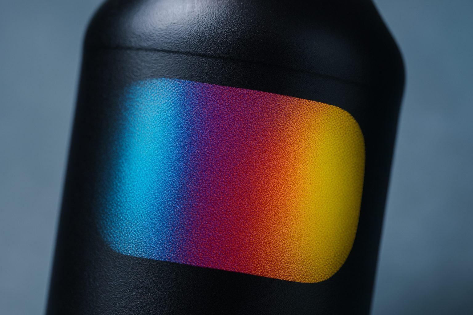
Process colour on glass and PET with logged LED cure.
View →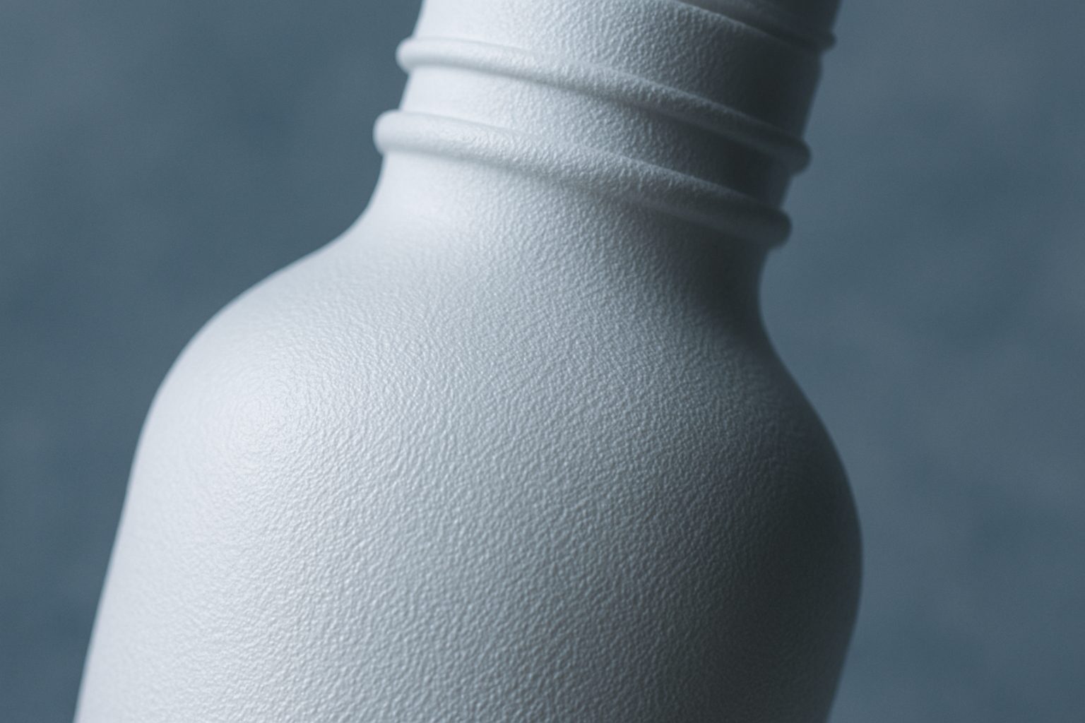
Dense white underbase without chalking, InkFlow controlled.
View →
Tactile varnish for skincare lids and premium beverage panels.
View →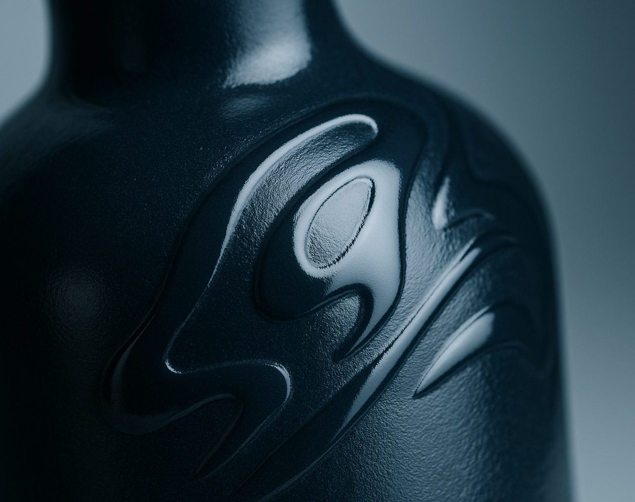
High-gloss protective varnish for shelf photography.
View →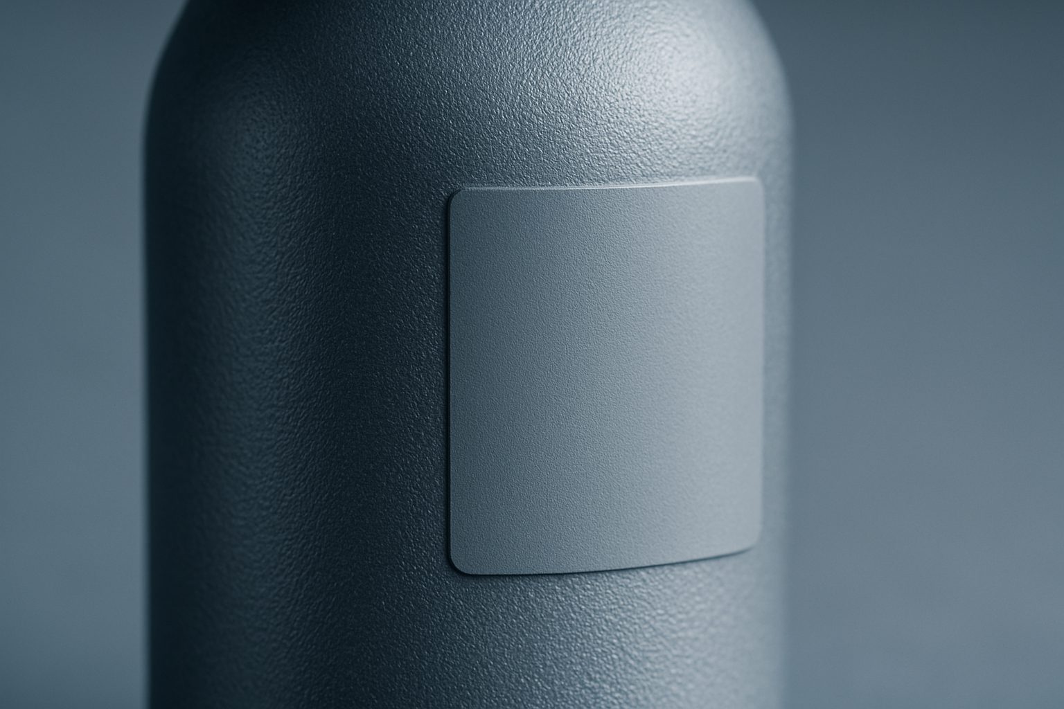
Matte UV panels that reduce glare on clear PET.
View →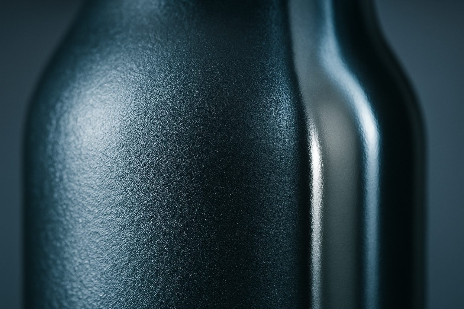
Selective metallic accents for spirits and gift packs.
View →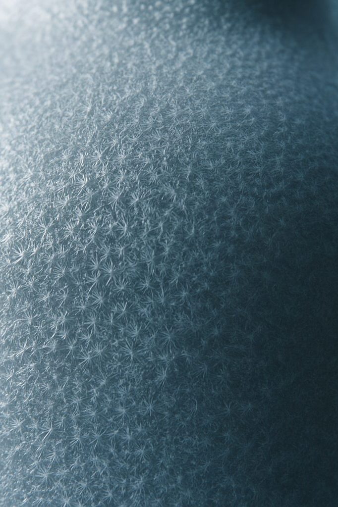
Resist effects that read as etched frost on glass.
View →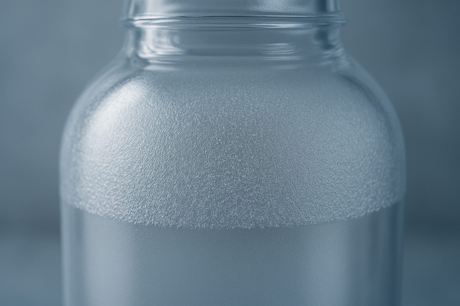
Primer pairings that keep crystal PET clear after UV.
View →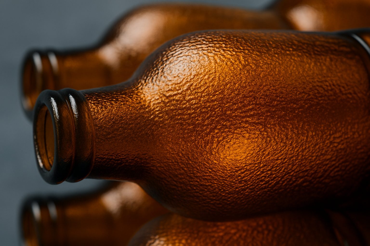
White + colour + varnish stack tuned for amber glass.
View →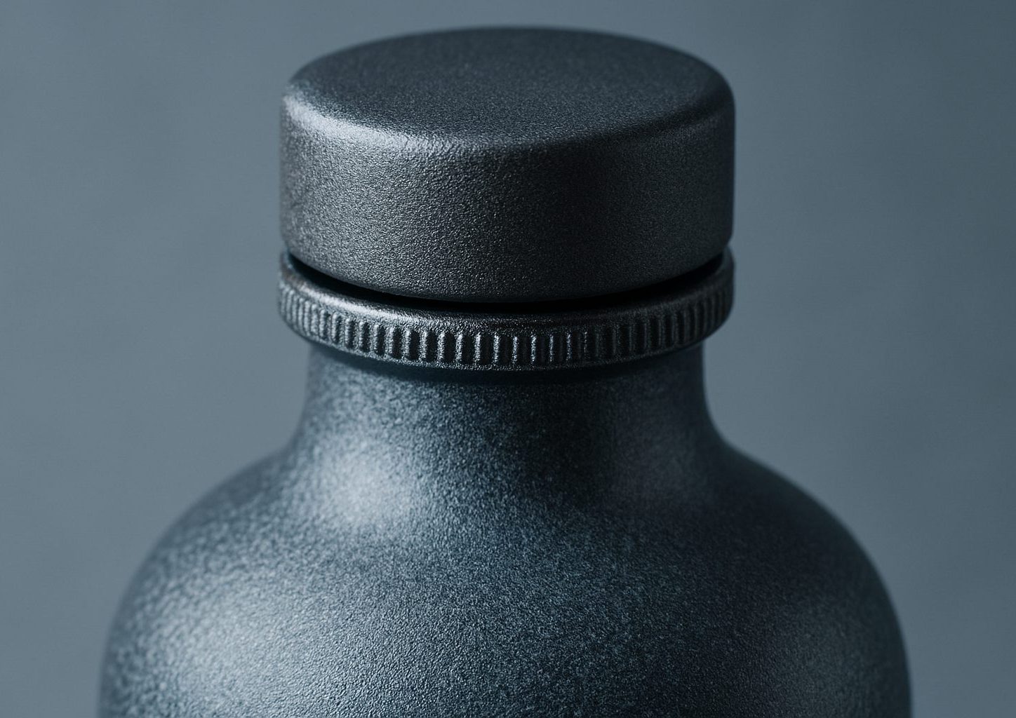
Lid and pump colour matched to bottle panels.
View →Inks and varnishes are not just about the look. On the factory floor, a finish stack keeps bottles branded no matter how many times they are handled, stacked or cleaned. The right primer and varnish stop ink from rubbing off in transit or peeling under Highveld dust, Cape Town humidity or during a tough shelf restock. South African producers in spirits, craft beer, skincare and contract filling rely on the correct stack, CMYK process colour, a dense opaque white underbase, protective gloss varnish or a primer for crystal-clear PET. A finish that fails means rework, wasted stock and late shipments.
If you’re running small-batch promos, everyday beverage lines or cosmetic filling, choosing a finish isn’t just the printer’s headache. Brand owners, site managers, and the folks in charge of shipping want bottles that look right and stay scuff-free. The finish choice matters whether you’re kitting out a start-up gin line in Durban or scaling a skincare range in Johannesburg. In-shop agencies, sign studios and contract packers need to know which stack will handle pick-and-pack, municipal cleaning and UV exposure from display lighting.
Start with what your customers will do with the bottle. For glass spirits, a metallic accent or frost effect makes a shelf impact, but needs the right underbase to survive. For clear PET, using the proper clear PET primer avoids cloudiness and guarantees strong adhesion through rough national shipping. Where tactile feel is part of the product, like matte skincare lids or premium beverage panels, a soft-touch varnish sets your product apart but needs matching protection underneath. Always check if bottles will need to match the closure, as our closure match set avoids surprises when lids and bottles land in different batches.
Most issues come from skipping a primer or the wrong varnish order. Ink can flake if applied without the correct primer, especially on PET bottles exposed to coastal humidity. On amber glass, white ink can shift colour if the underbase is too thin. Sometimes, gloss varnish is chosen for a look, but ends up highlighting every handling scuff on the bottle’s shoulder or edge. Closures get overlooked, so lids and pumps might arrive in a near-match that ages differently under sunlight. Always check the finish stack against your bottle supply and shipping routes.
Every project has quirks, from municipal water marks to three-phase supply interruptions. Our floor team have seen what survives load-shedding, humid Durban warehouses and the longest hauls into Bloemfontein. If you’re unsure which stack to use, ask for sample prints on your actual bottle, most weeks our team runs test panels for Gauteng, Cape and KwaZulu-Natal clients. Use our contact form for finish advice specific to your application, or browse the Catalogue for technical sheets. For more examples, see completed Projects or Notes on South African finish challenges.
Our contact form · Sunnyrock applications lab